When a building has a story to tell
WWF-UK recently moved to an extraordinary new HQ, the Living Planet Centre in Woking.

It’s designed to be one of the most sustainable buildings of its kind in the UK, using smart planning and tech to heat and cool itself, generate its own power and enhance the ecology of the land around it.
It’s also unusual for being a space that the public can visit to find out about WWF-UK’s work.
Ahead of the move, WWF-UK asked Neo to create a data visualisation that would bring the environmental story of the building to life, and influence staff and visitor behaviour through display of live data across the site.

We began by reviewing the potential sources of data for the new building with WWF-UK’s environment manager. A lot of that was due to come through the BMS – the Building Management System that helps control and measure the way the building responds to different uses, times of day and weather conditions.
Then we thought hard about what would be interesting and useful for the very different audiences.
For staff, the building would be their daily workplace, and the screen information something they could see all the time. That meant that what’s shown to them must change and if possible became more interesting over time, not just part of the scenery. We also knew that WWF-UK staff are more environmentally aware that most, and shouldn’t be spoon-fed messages about ‘how to be green’. So we concentrated on data that could be used to inform staff discussion and even fuel healthy competition.
The public part of the building was a different matter. It was going to be visited by school groups, members, corporate partners and local people, many of whom would see the screens during just one visit. For these groups, it would be more important to see how the building works, and what’s happening there and then, instead of what’s happened over time.

Taking these insights, we sketched a host of designs to show data in a bright and accessible way.
We took the proportion of the building’s energy being powered by solar panels, and put it in a sun-shaped pie chart.
The water saved daily by the water-recycling system made a numbers of bathfuls.
And the amounts of waste generated around the site, month-by-month, was colour-coded to show recycling of different materials.
We suggested adding webcams to the outside of the building and a bird-feeding station, so that anyone could play a part in recording the biodiversity as it develops around the site.
Once we’d settled on the concepts for the different sets of visualisations that would suit visitors and staff, we developed the look and feel in line with WWF-UK’s brand guidelines.
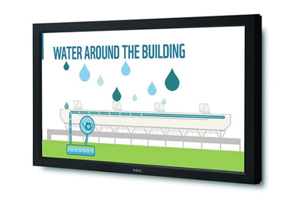
For the map of the site, and visualisations of how water and air flows around the Living Planet Centre, we came up with a series of animations.

As time goes on, the accessibility of the display screens will help staff and to interact with the Living Planet Centre, be inspired by what it represents and make better choices based on meaningful data.
And with our web development partners BrightMinded, we created the final, gently animated live data designs, testing them to ensure that they worked with the data formats available through the building’s software.
As anyone who’s ever moved offices into a new building will tell you, the transition is rarely smooth. The move date changed, and the data required for some screens couldn’t be made available as we’d all expected.
But the range of different screens, including the animated films, ensured that the team at WWF-UK had material for the screens that could go live from the beginning, with other visualisations following on as live data becomes available.


