Stepping up to the mark with Young Women’s Trust
So a month in at Neo having worked on a number of reasonably low pressure, easing in type jobs I was trusted with my first branding project. I’ve taken on rebranding projects before as a freelancer for small independent brands, but never a large organisation like Young Women’s Trust. I wasn’t just a newbie to Neo but also to the agency environment, working with other creatives that I respect and admire. I felt this was my first test, a chance to prove myself, show that I knew what I was doing.
Myerscough’s work has a very feminine, modern feel to it, so I felt she was perfect inspiration for the design work on this project.
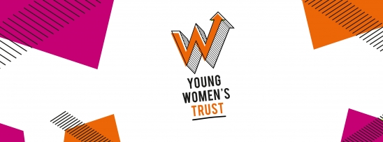
I started by making the letterform – a three-dimensional, halftone shaded, pop art styled ‘W’ featuring an upward pointing arrow – more interesting. I replaced the spots with horizontal lines to accentuate the three-dimensional form of the ‘W” and give it a more dynamic and energetic feeling, reflecting the qualities often found within young women themselves. Then I misregistered the colour block within the logo, giving it a more personal, imperfect, hand rendered feel. The change was subtle but I think it gave the logo new life. I began to think about how this feeling could carry over to the typography featured in the logo. I chose a font called ‘Bebas Neau’ which not only gave the typography a bold, confident feel but would appeal to a young audience. To give the logo energy I slightly tilted the typography, which worked well with the three-dimensional quality of the ‘W’ and carried on the theme of imperfection. The word ‘trust’ stood out to me and fitted well with the charity’s approach, so I gave it prominence by highlighting it in the same colour as the ‘W’ logo to contrast against the rest of the typography and adding a hand drawn underline. This accentuated the word, and its hand-rendered quality again gave it a more personal feel. We worked closely with the Young Women’s Trust team to decide on the colour palette.
We wanted to avoid stereotypical ‘female colours’ like pink and any colours already being used by similar organisations.
Eventually we settled on primary brand colours of orange and black and secondary colours of cerise and green. Since Young Women’s Trust didn’t yet possess any photography to use in their branding, the brand language needed to consist purely of visual and typographical devices. We decided to create a consistent visual style influenced by the features of the logo we’d already created. We took the misregistered colour blocks and line patterns from the logo and used them at a variety of angles in both the primary and secondary colour palettes across the event collateral and impact report. One of the biggest challenges of this job was the incredibly short turnaround – a month from brief to the delivery of printed assets. Having such a limited time to rebrand the organisation and create all their brand assets as well as an impact report felt like a big ask for me. Being relatively inexperienced in the industry I didn’t know if this was a particularly tight deadline or if I just wasn’t working fast enough. From speaking with the team and reflecting on my own practice I came to the conclusion that as long as I felt I was working in the best way I could in the time given. Feeling completely happy with your own work is for me and I’m sure many other designers a difficult thing, but at the end of the project I was proud to deliver a unique, vibrant brand to Young Women’s Trust.


